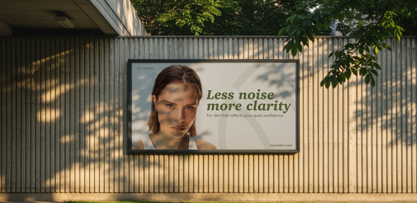
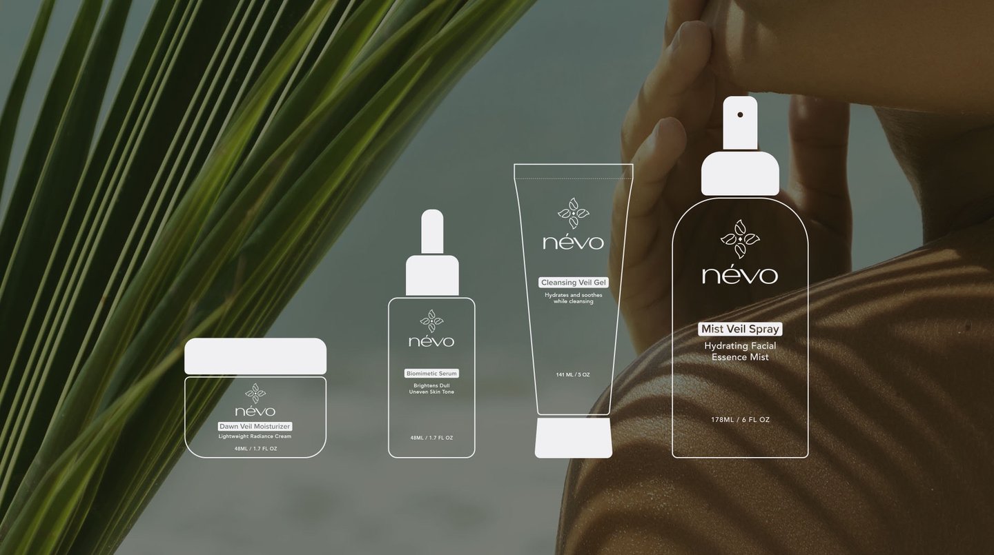
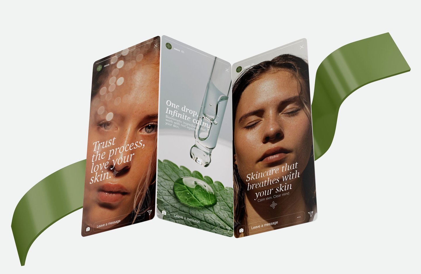
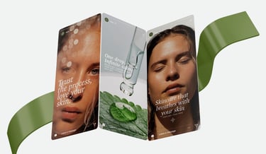
Névo is a skincare brand that brings together clean design and advanced science. Inspired by the refreshing nature of mist, it creates lightweight, high performing products using ethically sourced botanicals and biomimetic technology. Every formula is made to support healthy, balanced skin while enhancing its natural glow.
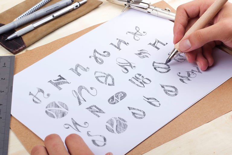
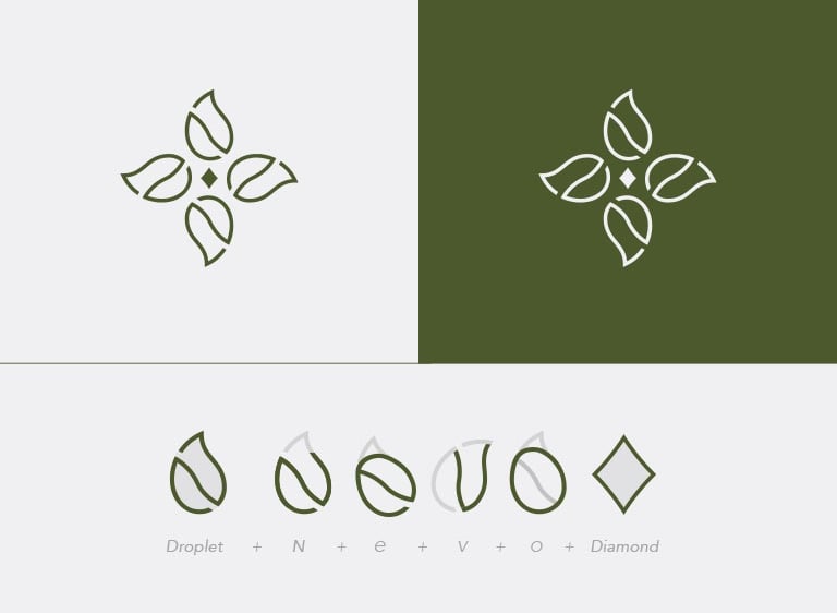
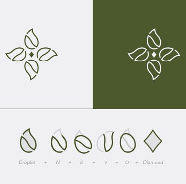
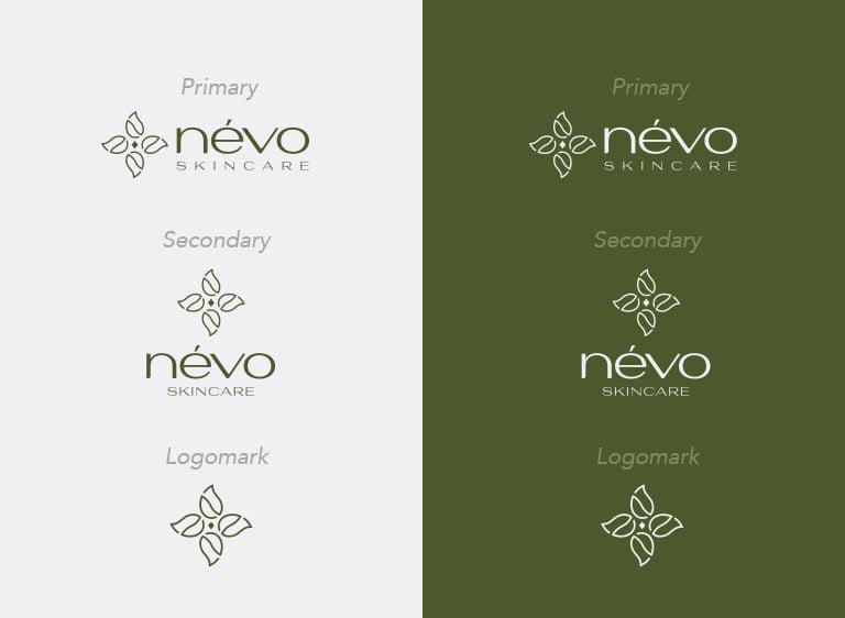
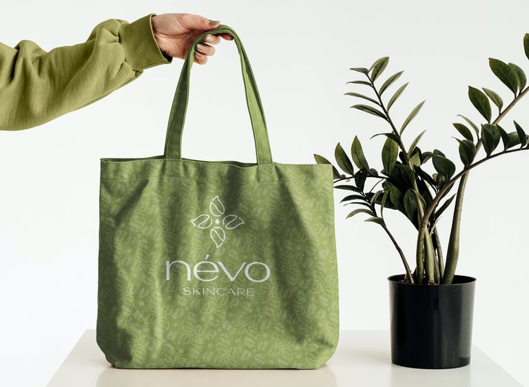
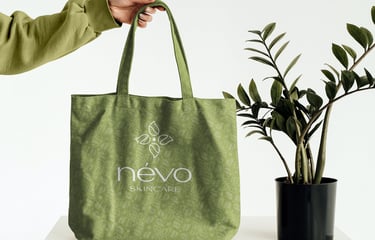
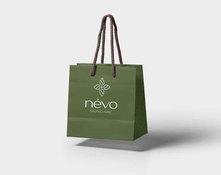
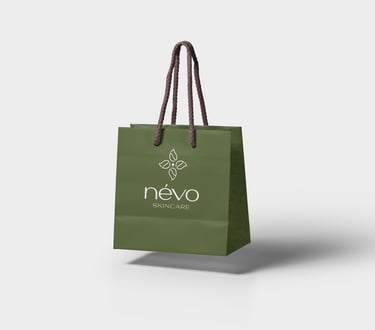
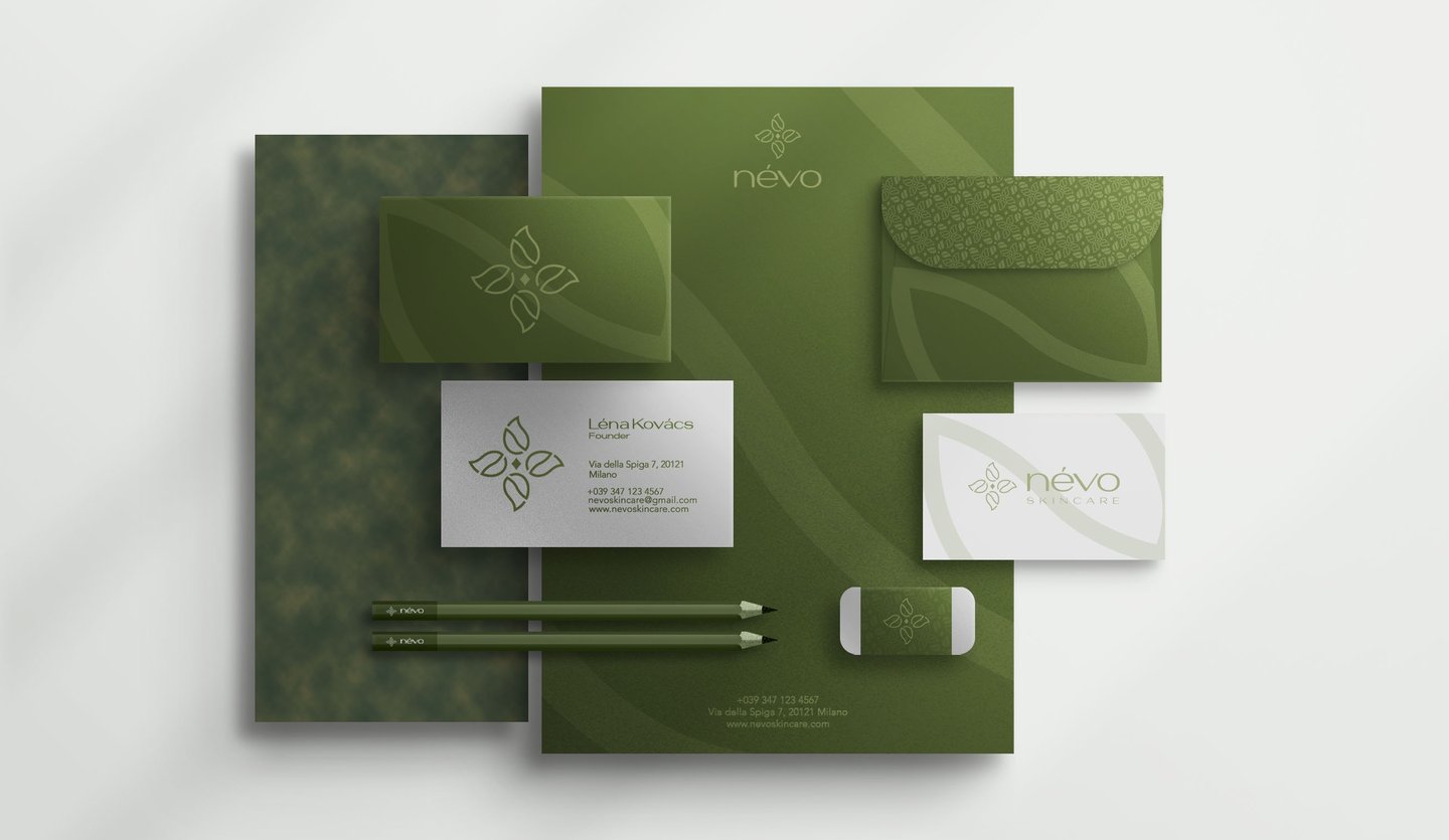
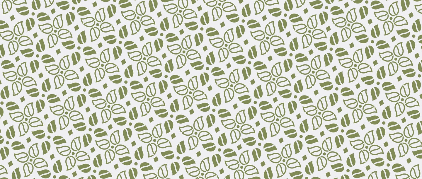
As the designer behind névo’s visual identity and packaging, I developed a logo that reflects the brand’s essence: purity, science, and balance all inspired by the calming nature of mist. A floral mandala inspired symbol combining droplet shapes that evoke hydration and fluidity, stylized letterforms from névo (n, e, v, o), and a central diamond representing clarity, precision, and skin integrity reflecting névo’s balanced approach to skincare.
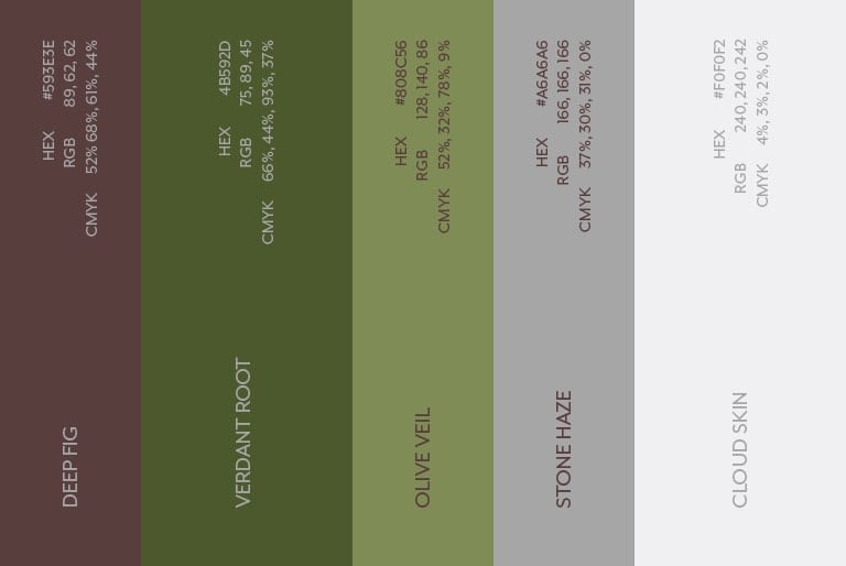
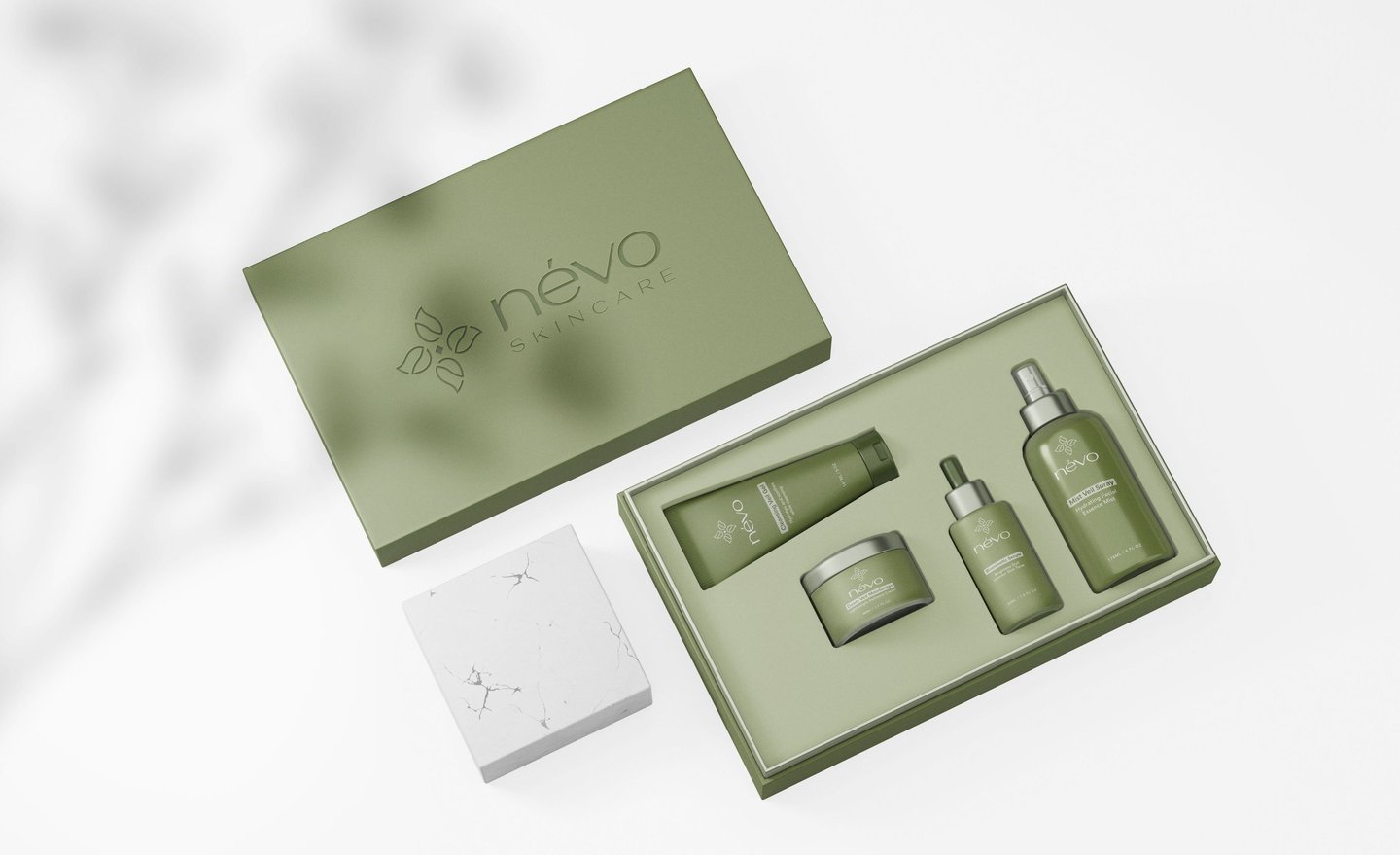
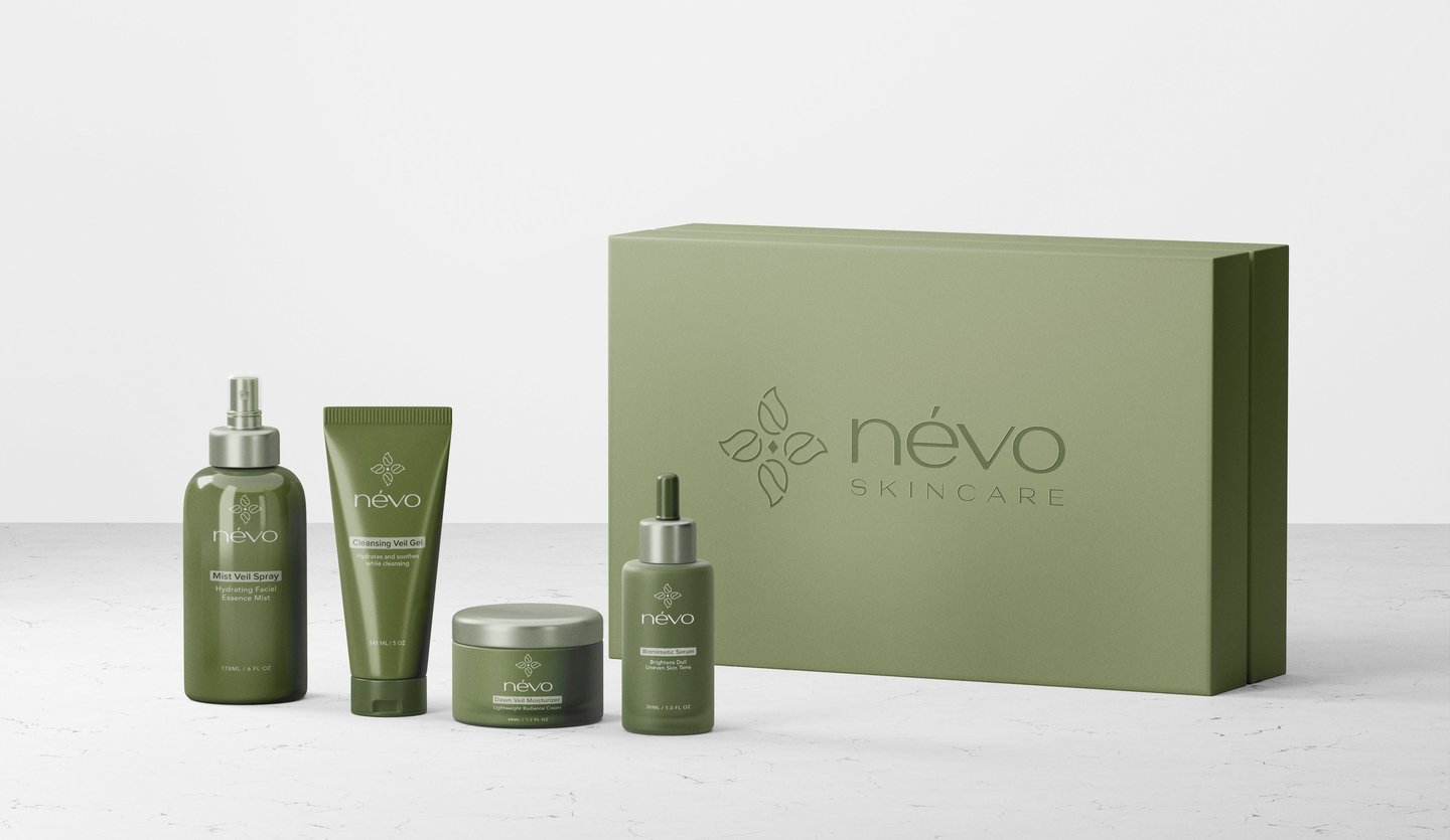
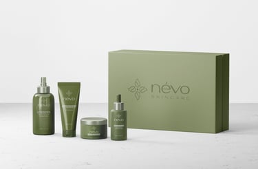
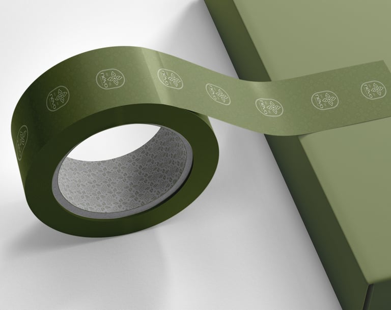
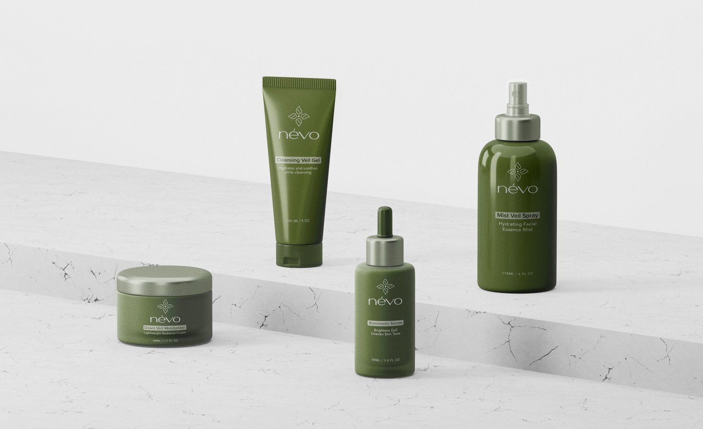
The Névo packaging design presents a refined, modern aesthetic that reflects both simplicity and elegance. Featuring a unified box set and a cohesive, muted green color palette, the design reinforces the brand’s identity while offering strong visual harmony across every touchpoint. This intentional use of form and tone ensures consistency, elevates user perception, and deepens engagement through a calming, sophisticated presentation. By aligning seamlessly with the brand’s core values of purity, science, and quiet luxury, the packaging communicates trust, professionalism, and purpose ultimately creating a memorable and credible presence in the premium skincare market.
Disciplines
Visual Identity
Category
Packaging Design
Skincare
Tools
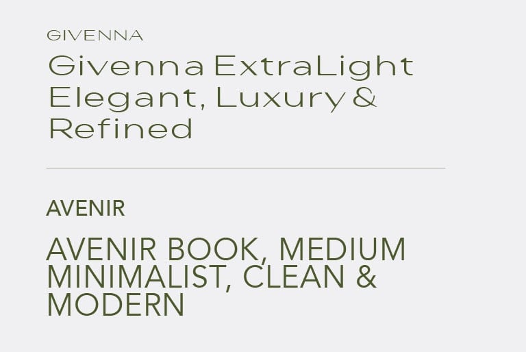
Adobe Photoshop, Adobe Illustrator
Packaging Design